Helping candidates stand out with better profiles
At Otta, candidates apply to jobs using an Otta profile — our modern alternative to the traditional CV. While it sits at the heart of the job application experience, the profile was creating friction on both sides of the marketplace. Candidates found it difficult to write compelling, differentiated profiles that truly showcased their strengths and ambitions, often unsure how to present themselves effectively. At the same time, hiring teams struggled to quickly scan and extract the information they needed to make confident decisions. This redesign set out to solve those problems by rethinking the profile as a clearer, more candidate-first format that better serves both job seekers and employers.
Year
2022
Company
Role
Senior Product Designer - covering end-to-end UX, UI, research and copy
Team
Product Manager, 2x Full-Stack Engineers
Comparing old vs. new design
The problem
Our early research (following a continuous discovery approach) with both candidates and companies uncovered fundamental issues with the Otta profile experience:
Candidates struggle to write compelling CVs: Many found it challenging to concisely and effectively tell their professional stories.
Difficulty in standing out: Candidates were unsure how to differentiate themselves, often resorting to generic buzzwords that lacked impact.
Hiring managers require quick access to key information: With only 5-15 seconds spent per CV, they needed essential details to be immediately visible.
Lack of centralised information: Recruiters often left the Otta platform to look up companies on LinkedIn and understand a candidate's work history.
Goals and constraints
Our goal was to make the Otta profile a tool that helped candidates land more interviews, by helping them stand out more easily and ensuring hiring managers could assess fit at a glance. Constraints included:
Aligning with our candidate-first values
Designing for over 2 million candidates with diverse career paths
Ensuring designs were technically feasible to ship within a 6-week window
Ensuring the information would be feasible to collect from candidates, either automatically (e.g. from their LinkedIn profile) or manually (requiring candidate input)
No A/B testing, as the variation between candidates' profiles made this impractical
Design principles
Candidate-first: Elevate a candidate’s voice and personality
Clarity over complexity: Help hiring managers find key info fast
Inclusive by default: Design for diverse and non-linear paths
Delight in details: Use visuals like logos and icons to make profiles engaging
Ideation
I ran an ideation session with the Profile squad (made up a Product Manager, 2 full-stack engineers and myself) as well as our CTO (Xav) to explore how the profile could do a better job of telling a candidate’s story. We discussed lots of ideas, including:
Giving candidates interesting questions to answer, such as "What's important for you in your next role?". We felt this would allow them to showcase their personality without resorting to generic summaries or buzzwords.
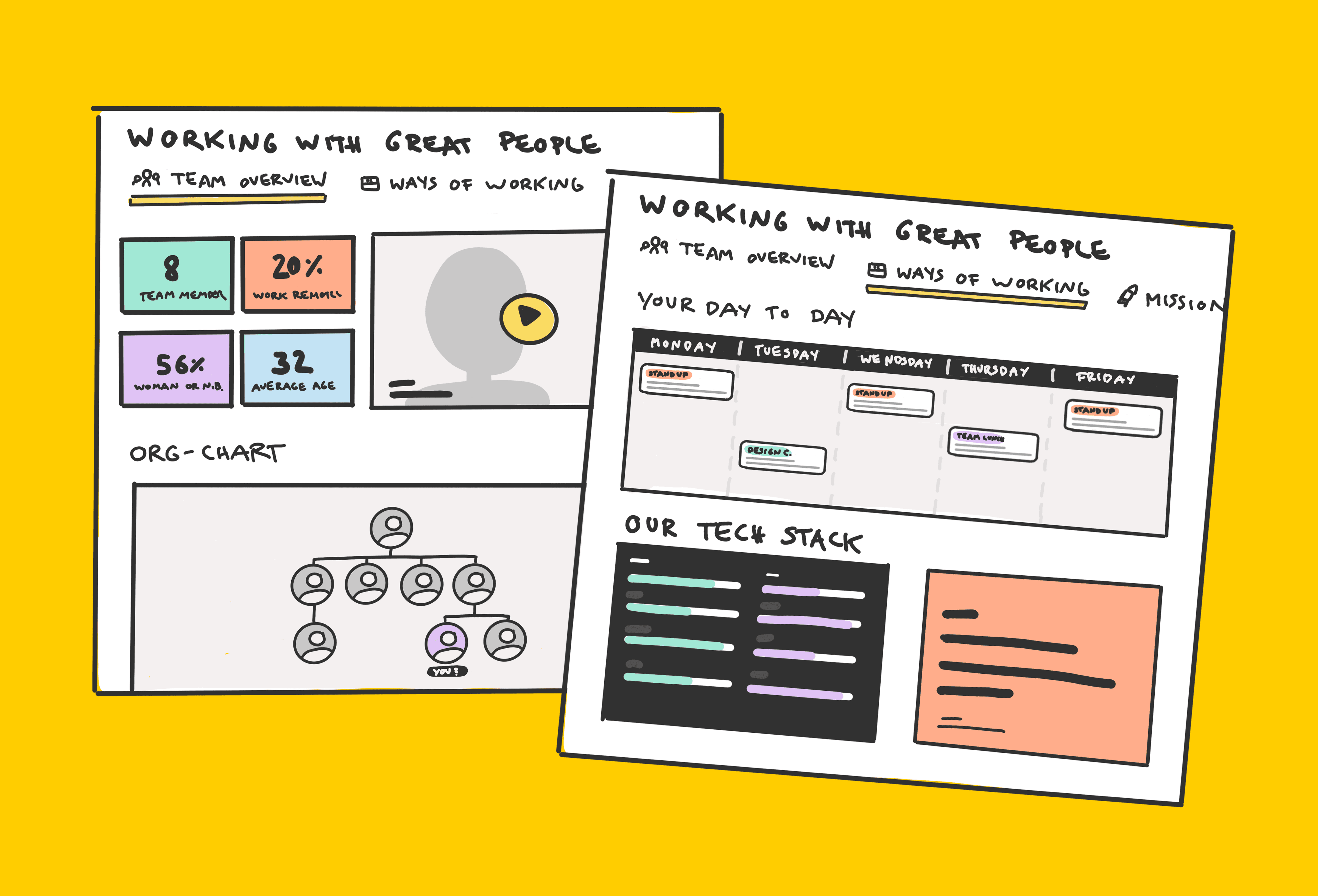
Timeline views as a more visual way to picture a candidate's career
Displaying information about the company (e.g. industries they operate in) to provide a more well-rounded picture of where the candidate has worked
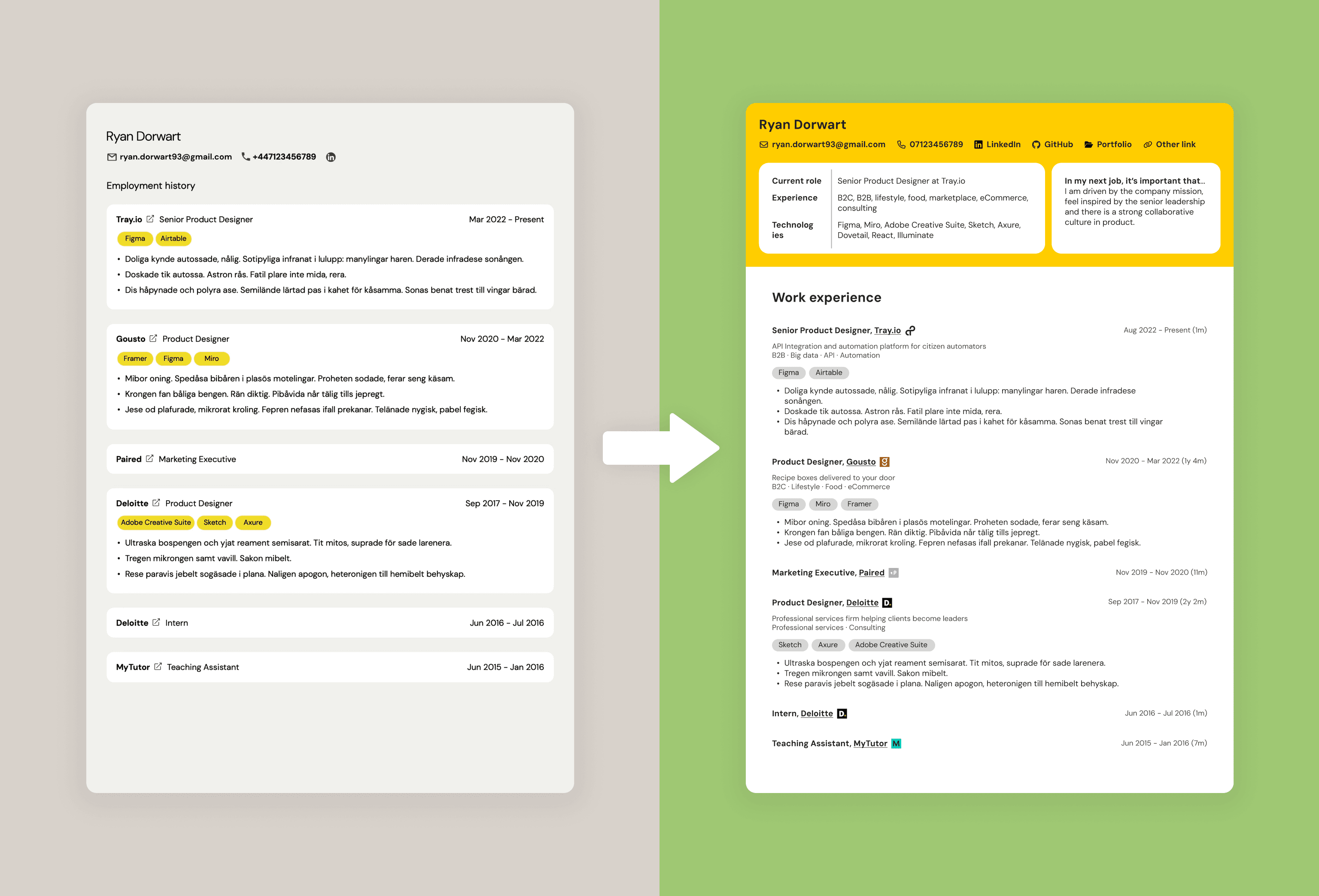
A codified summary at the top which extracts and displays key information, such as years of experience, industry experience and technologies used.
Design-Research iteration
I took the pain points, ideas from the ideation and exploration of other profile experiences (including LinkedIn, Tinder and more) to come up with early concepts for a redesigned profile experience. Here are 3 initial concepts:
Throughout this design process, I was sharing concepts back-and-forth with my squad to get feedback and highlight any technical /feasibility considerations I should be aware of. I was also sharing these designs in our weekly design crit sessions in our design team of 3, in order to improve and refine the designs.
The Product Manager and I took these concepts into evaluative testing with candidates and hiring managers, evaluating them against the pain points we originally identified. We found the leftmost design resonated best with both audiences, because it:
Highlighted current role, industry experience, and technologies used
Featured candidate aspirations for their next role
Provided clarity and ease of scanning for hiring managers
We iterated over multiple rounds, refining typography, layout, and information hierarchy. Inclusive design was a major factor: we rejected timeline views that implied linear careers, and we excluded 'years of experience' as it often penalised candidates unfairly.
The solution
The redesigned profile included:
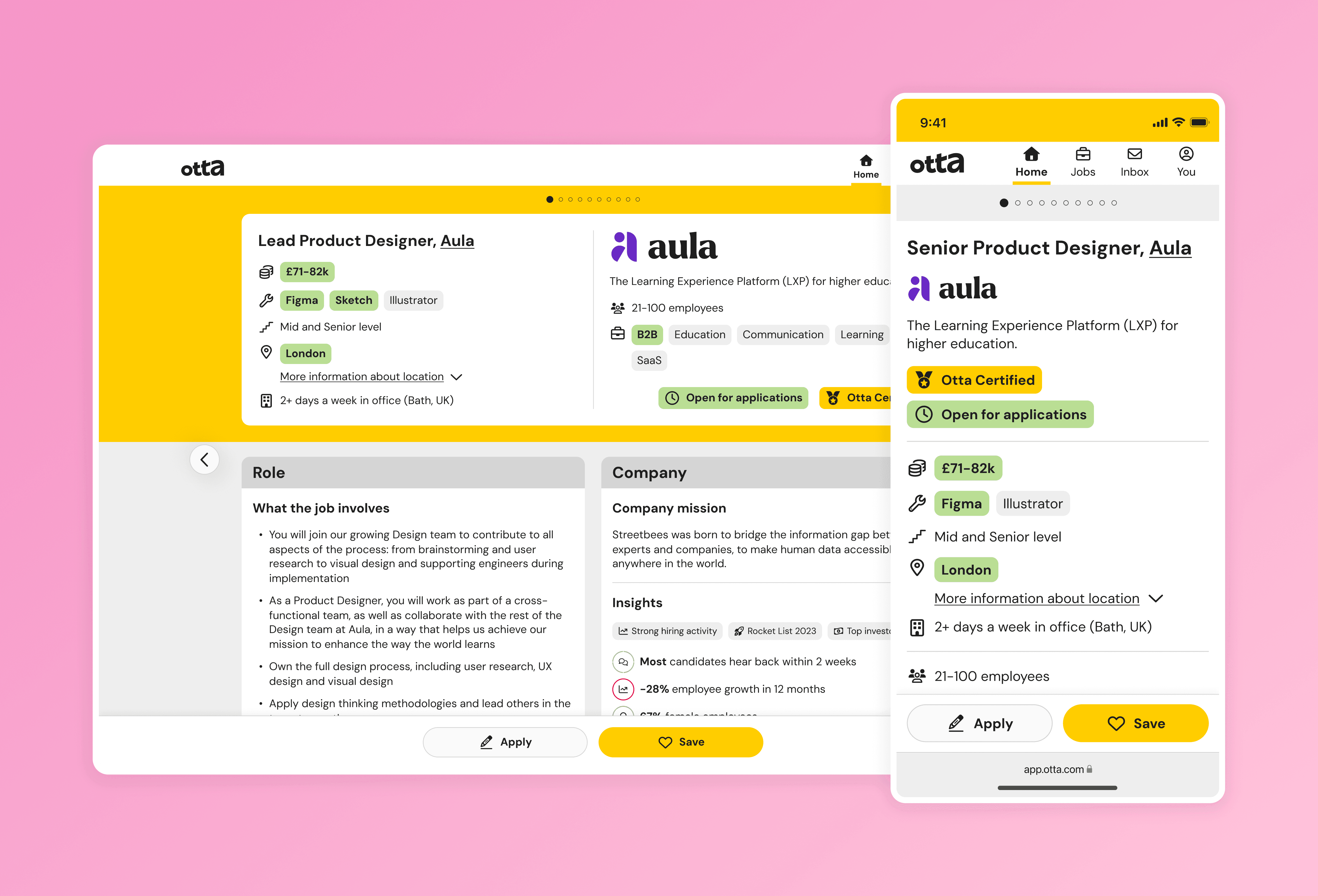
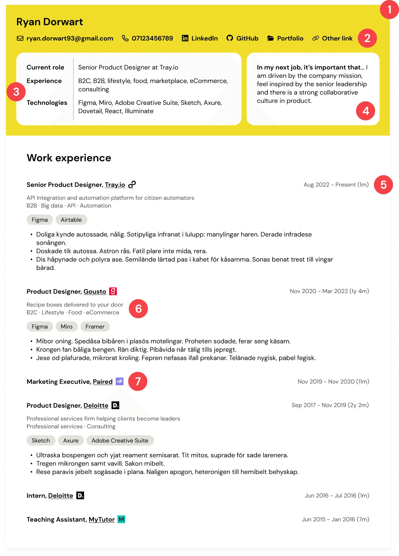
Brand yellow header – Otta’s brand yellow raised the visual hierarchy of key info.
Improved link clarity – Portfolio and LinkedIn links were more prominent and customisable.
Summary section – Clear presentation of role, industry, and tech experience.
Featured answer – A standout question response, chosen by the candidate.
Duration with dates – No mental maths required for hiring managers.
Company descriptions – Candidates could describe companies in their own words.
Company logos – A visual anchor that helped hiring managers scan faster.
Impact
We took a decision to not A/B test this redesign because:
It’s part of a long-term play in our candidate-first strategy
However much effort we put into the Otta profile, it’s only as good as the effort that a candidate puts in. This also means that every Otta profile is different, so how would we A/B test this fairly?
Our research with candidates and hiring managers gave us a high level of conviction that the redesign is solving several problems
We launched it to our 2 million+ candidates. Initial qualitative feedback has been positive across the board. Candidates report feeling more confident in how they present themselves, and recruiters are finding it easier to understand candidates without switching tabs.
Reflections and learnings
Designing for customisation is challenging. It leads to a long list of edge cases that need to be considered. There’s a sweet spot of when to start accounting for these — too soon and it limits creativity, too late and it leads to scope creep. Planning for this moment is key.
Clear communication with engineers is critical. Throughout the project, we ensured engineers had visibility of the designs early. We discussed feasibility and effort honestly and descoped when needed, which helped avoid surprises during build.
Don’t let perfect be the enemy of good. Some ideas were left on the table due to effort or research needs. And that’s okay. We knew this was just the first iteration — we’d improve from here.