Improving the visual hierarchy to help job seekers find their match
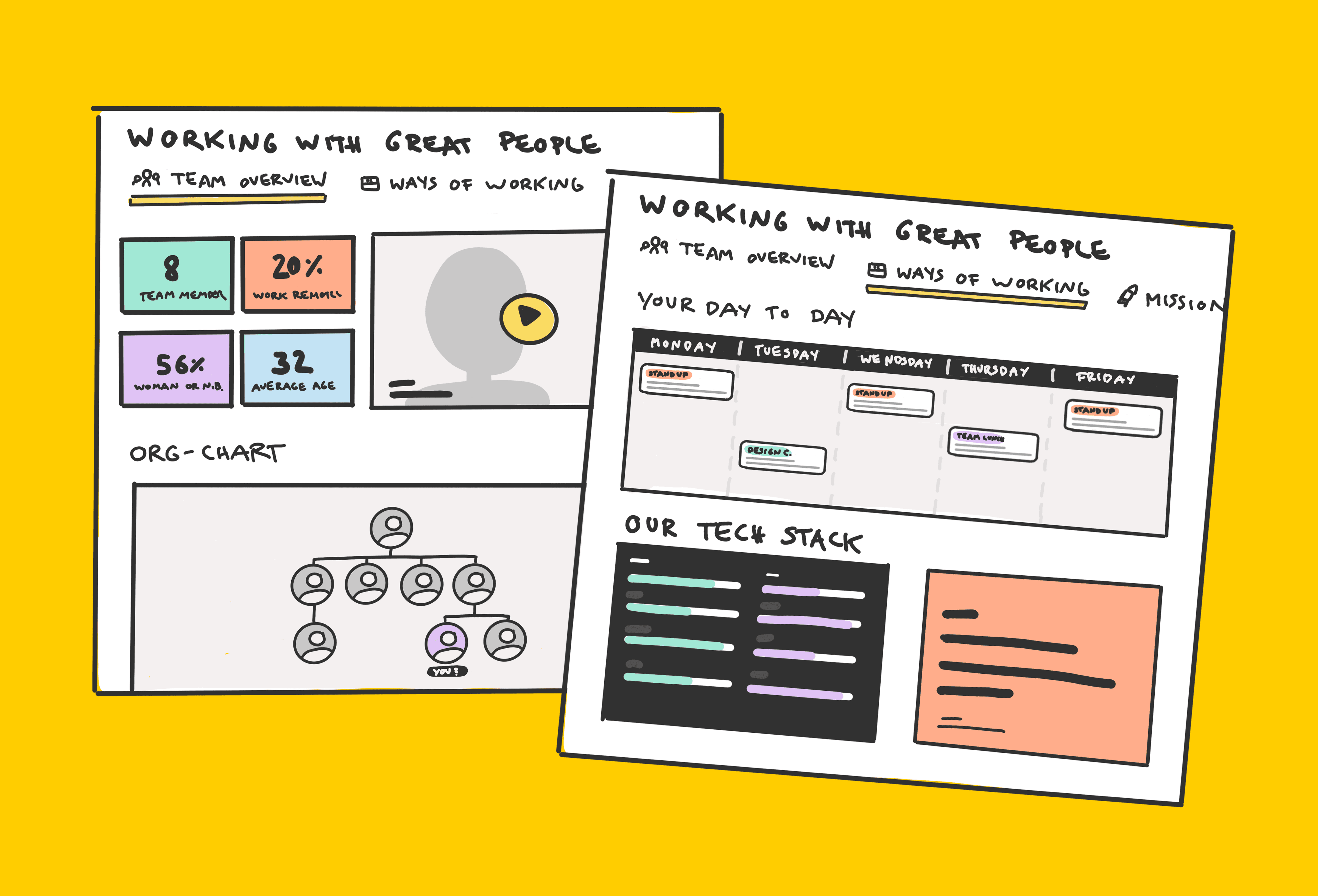
The job card is central to the user experience on Otta (now Welcome to the Jungle)—it receives over 90% of all traffic and acts as the primary interface through which users (candidates) interact with job listings. The original design had remained untouched since the company’s early days. As the product matured, so did user expectations. My challenge was to redesign the card to surface key information more clearly and improve interaction patterns, all while preserving the one-job-at-a-time experience that defines Otta.
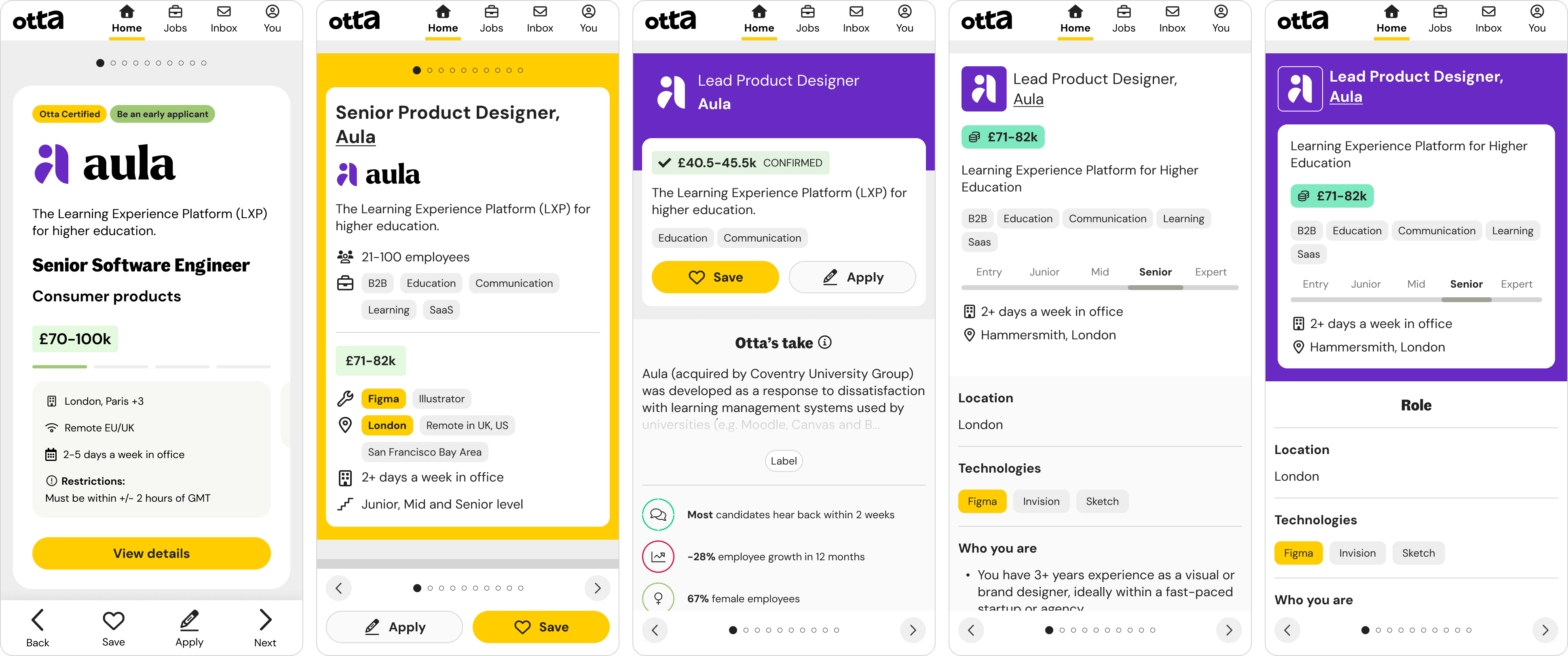
Year
2022
Company
Role
Senior Product Designer - covering end-to-end UX, UI, research and copy
Team
Product Manager, 2x Full-Stack Engineers
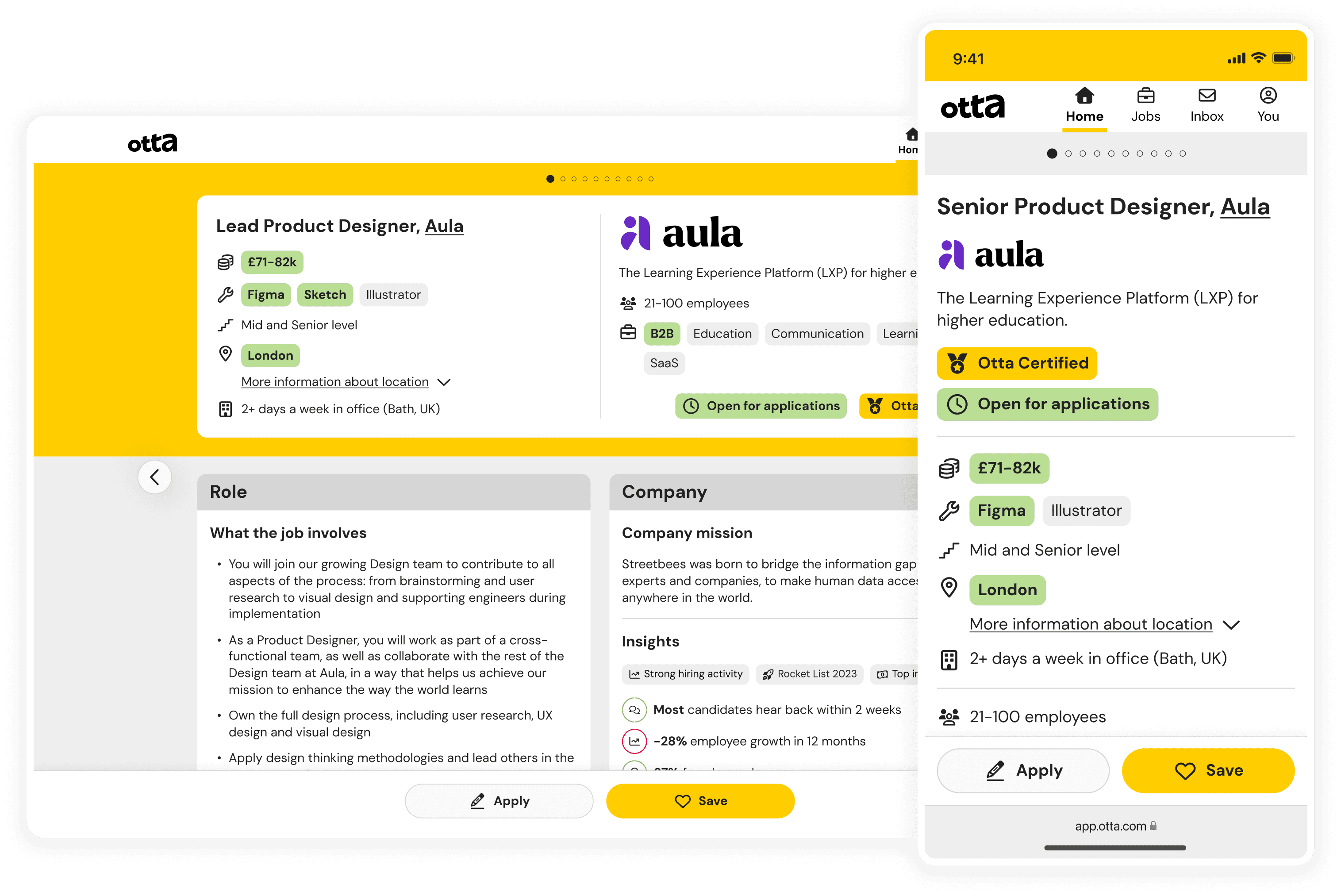
Final design
The problem
Our squad followed a continuous discovery approach to research, running 5-6 candidate interviews each week. This revealed that:
Candidates struggled to quickly locate essential job information like salary, location, tech stack, or seniority
Floating action buttons (FABs) were poorly designed: labels disappeared on scroll and they overlapped with content
Years of small UI tweaks had led to inconsistencies in typography, icon use, and alignment
Despite being core to the product, the job card wasn’t helping candidates make fast, confident decisions.
Goals and constraints
We aligned the project around two key outcomes: increase apply clicks and increase save clicks.
Other potential metrics (e.g. time spent on a card, jobs viewed) were intentionally deprioritised because they didn’t necessarily correlate with positive candidate behaviour. Our constraints included:
Preserving the one-job-at-a-time philosophy
Designing for mobile-first (80%+ traffic)
Process
Generative research
We followed a continuous discovery process at Otta, meaning the Product Manager and I were responsible for speaking with 5-6 candidates each week to identify the pain points and opportunity areas faced by our users. We documented this research in Dovetail, and it was this research which highlighted the opportunity area to improve our job cards which determined the focus area for our squad.
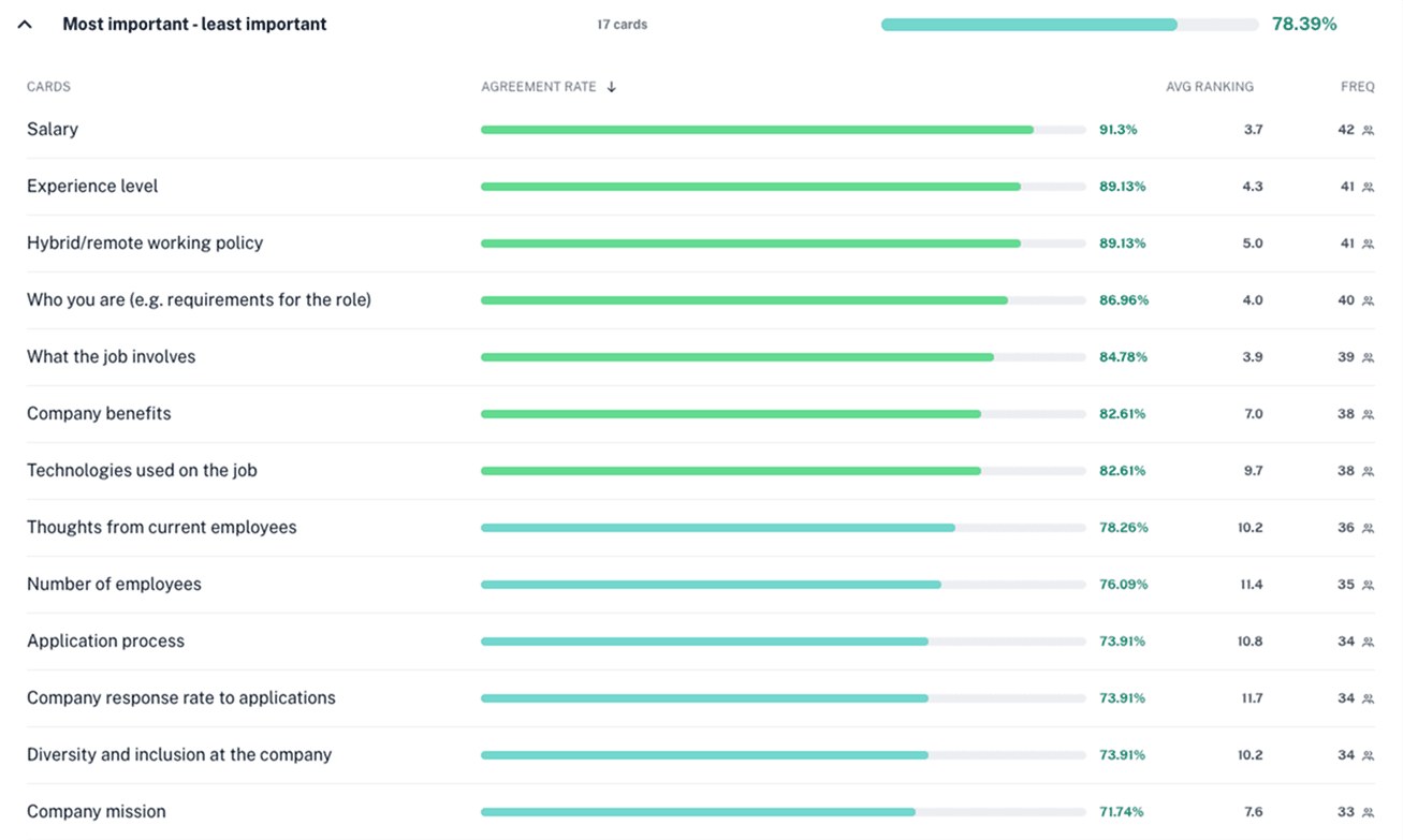
Unmoderated card sort
After identifying the job card as a priority area, we started by understanding what information candidates actually cared about. I led an unmoderated card sort asking candidates to rank job card sections from most to least useful. We used the output to map content into "Must have", "Should have", and "Nice to have" tiers. This became the starting point for my design exploration.
Design-Research iteration
In parallel, I reviewed adjacent platforms like Airbnb, Rightmove, and Cazoo to study how they structured decision-making content. While the visual style didn’t translate directly, their codification of key info via tags and icons sparked useful inspiration.
We rapidly prototyped several versions of the card and tested them through moderated sessions with engaged Otta users.
Why moderated? We wanted to tailor cards to each participant to avoid skewed feedback (e.g. if salary was too low, they might dismiss the whole card). Testing with real users from our platform allowed us to move quickly—Otta candidates were highly engaged, and recruiting participants was fast, low-cost, and low-friction.
Through multiple rounds, we refined the design based on:
What candidates noticed first
Whether they felt equipped to decide quickly (skip, save, or apply)
What visual hierarchy worked best
Here are some of the designs we explored and took into various rounds of testing:
Design principles
Information at a glance: Candidates should know within seconds whether to engage further
Hierarchy over clutter: Prioritise decision-making content above the fold
Design for fatigue: Consider how to avoid burnout when viewing many cards
Managing scope and learning fast
We identified two key streams of work within the job card redesign:
Changes to the layout and content of the card itself
Changes to the navigation and interaction patterns
To move quickly without compromising on quality, we brought engineers into the process early. They suggested running a quick experiment on the navigation changes while we continued refining the card design. This parallel track enabled faster learning, clearer feasibility insights, and better-informed prioritisation of what to ship first.
The solution
The final card redesign:
Elevated key details like salary, location and seniority
Highlighted requirements that matched a candidate's preferences for quick glanceability
Removed FABs and replaced them with a bottom navigation bar
Introduced clearer icons and typographic hierarchy
Addressed visual quirks and aligned layout consistency
Focused mobile-first, with particular attention to touch targets and layout spacing
Impact
We A/B tested the redesign and saw:
+15% increase in apply clicks
+20% increase in save clicks
This confirmed that the new card helped candidates make decisions more confidently and quickly. We rolled it out to 100% of users shortly after.
Reflections and learnings
Small changes compound. Much of this work was about refining structure, copy, and spacing. These details had outsized effects on user behaviour.
Parallel tracks accelerate learning. By A/B testing navigation changes while refining the visual design, we identified high-impact changes sooner and avoided bottlenecks.
Challenge assumptions deliberately. We kept the one-job-at-a-time model intact, but validated that major improvements could come from rethinking content hierarchy and visual clarity.
Speed comes from alignment. By engaging engineering early, we were able to scope realistically and move quickly without compromising quality.