Clarifying the value proposition to reduce early drop-off
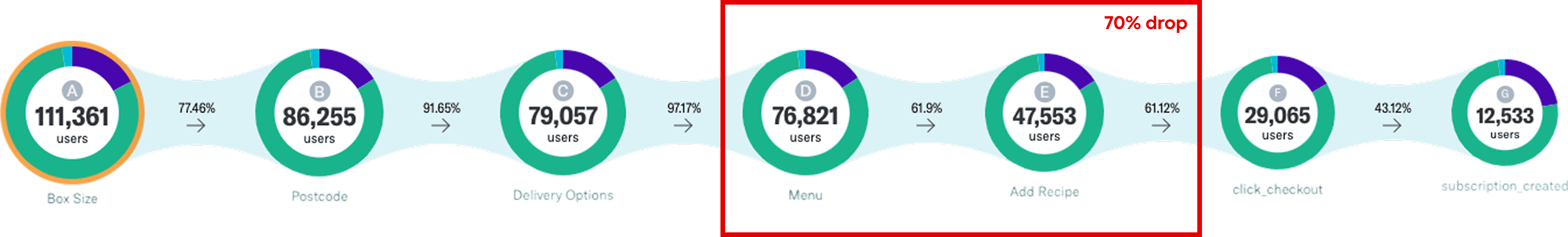
As part of a cross-functional squad at Gousto, I led the end-to-end design work to improve sign-up conversion (CvR) from landing to payment. We discovered that 70% of prospective users dropped off early in the funnel—especially at the menu stage—without understanding what Gousto actually offered. My work focused on clarifying the proposition earlier in the journey and building confidence in the product, ultimately leading to a 2.3% increase in sign-up conversion and an estimated additional revenue of £2M annually.
Year
2022
Company
Role
Product Designer - covering end-to-end UX, UI, research and copy
Team
Product Manager, Data Analyst, 4x Engineers (2x Front-End, 2x Back-End), Head of Marketing, SEO Specialist, Digital Marketing Manager
The problem
70% of prospective users dropped off at the menu stage. User interviews and session recordings highlighted confusion around Gousto's proposition:
“I thought I was making a one-off purchase” – Dinesh
“It doesn't give me any information about how many boxes and when” – Ola
“Maybe a link to learn more” – Frances
Users weren’t clear on what Gousto was (a flexible subscription), what they were getting, or how it worked. This lack of upfront clarity was a key driver of drop-off.
Goals and constraints
Our primary goal was to increase sign-up conversion rate from landing to payment. We were also aware of:
The risk of introducing friction too early in the journey
Preserving performance in already high-converting areas
Adhering to Gousto's visual and brand identity
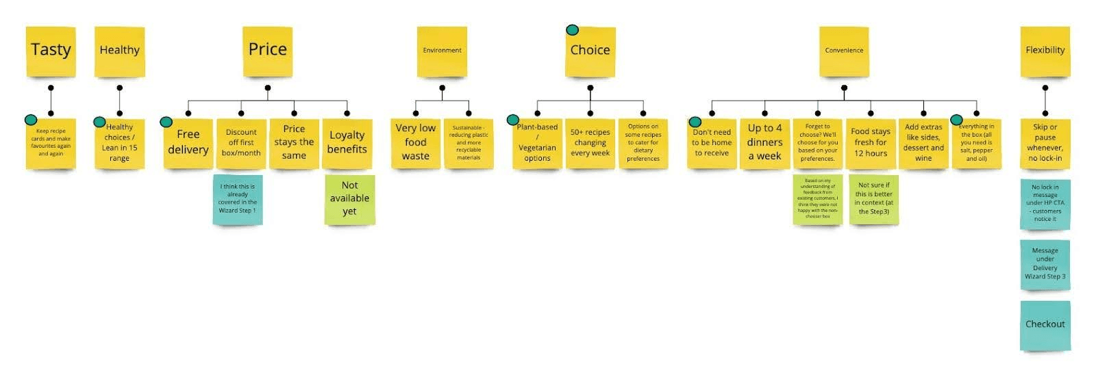
Value proposition mapping
We began by mapping out Gousto’s core value drivers, comparing them against competitor offerings. Using insights from previous research, we grouped them into themes and ranked them by likely impact. These informed copy experiments focused on clarity, value, and differentiation.
Design-Research iteration
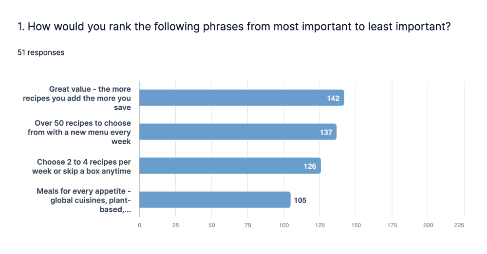
I developed copy and content variations for how we might communicate Gousto’s value, which we tested through two rounds of unmoderated research (50 users each). These studies validated the prioritised value drivers and helped refine the messaging.
Next, I worked with the PM and Data Analyst to determine where the messaging should appear. We evaluated three options:
Before wizard ❌ Too early; risks being forgotten
In wizard ❌ Introduces complexity in an already interactive step
Between wizard and menu ✅ Just before a key drop-off point; educational and contextual
This final placement struck the right balance of visibility and timing—educating users without overwhelming them.
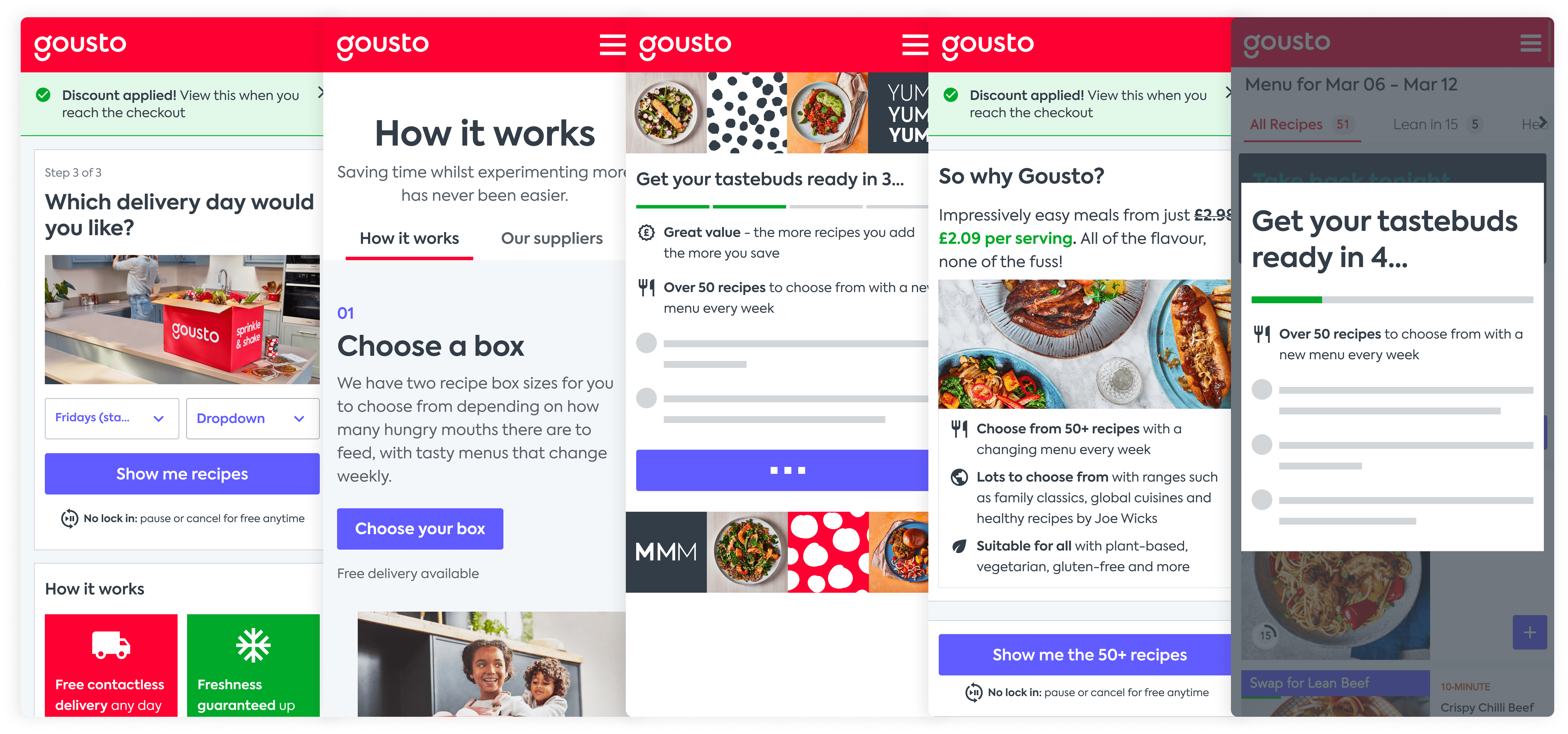
Once we aligned on where the messaging would live, I ideated and iterated on multiple content and visual directions. I explored different formats (e.g. cards, illustrations, FAQs, carousels) to find the best way to educate without overwhelming. I brought these into design critiques with the wider design team, clearly communicating my thinking and using their feedback to improve each round. This iterative process helped us land on a final design that felt informative, lightweight, and on-brand. Here are some of the directions explored:
Design principles
People don't read. Keep information glanceable and visual.
Context matters: Place information where it directly supports decision-making
Just enough friction: Introduce helpful guidance only where it delivers value
Managing scope
Throughout the process, I:
Collaborated early with engineers to ensure build feasibility
Avoided adding extra steps unless justified by research
Ensured the solution was visually aligned with Gousto’s brand
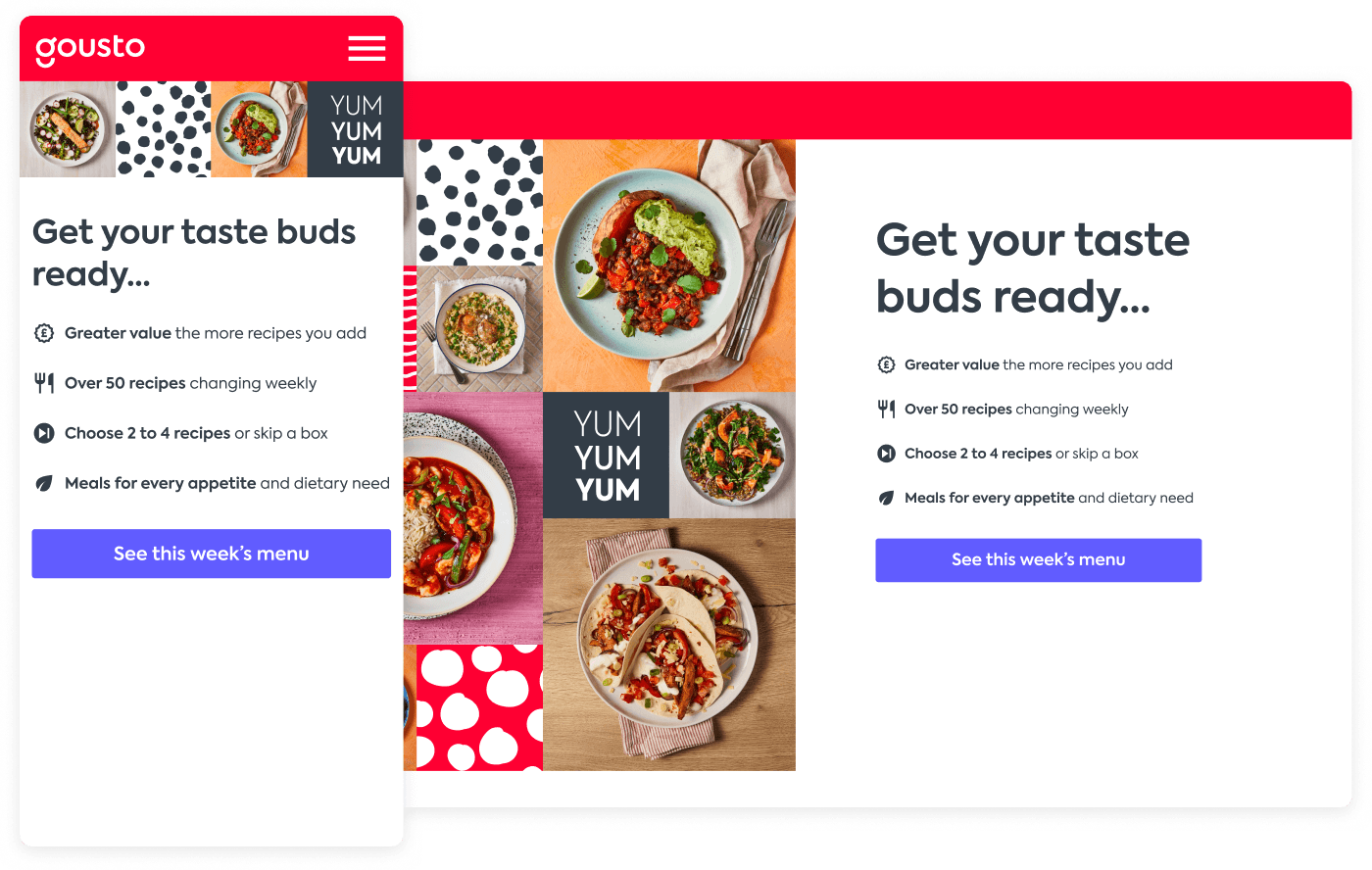
The solution
We introduced a ‘Sell the Proposition’ screen between the sign-up wizard and the menu. It:
Explained Gousto's pricing and subscription model
Highlighted what meals and choice users could expect
Used friendly copy, visuals, and a clear CTA to move forward
Impact
We ran an A/B test across 150k users, which showed:
+2.3% total uplift in sign-up CvR (p=0.02, 98% significance)
+4.5% uplift on desktop, where comprehension gaps were most pronounced
An estimated +£2M in annualised revenue from the change
Reflections and learnings
Positive friction can increase conversion. Interrupting the journey isn’t always a bad thing—if done right, it builds confidence and trust.
Clarity beats cleverness. Simple, direct messaging outperformed polished, marketing copy.
Timing is everything. Placing helpful information just before a key decision point had the biggest impact.
Cross-functional alignment was key. Close collaboration across product, engineering, brand, SEO, and marketing enabled a solution that was user-friendly, technically feasible, and on-brand.